Poster sessions can be quite frustrating – for everyone. Cognitive research offers tipps for better academic posters: the key message must be easy to grasp at a glance and inspire questions.
Imagine your next poster session: you are waiting patiently in front of your poster, well prepared to explain everything. Scientists from other institutions stop and start asking questions, challenging your assumptions, offering their expertise, and exchanging emails to keep in contact. Some of them even download your paper. You might be exhausted but quite happy and full of new inspirations. Because exactly this is what poster sessions are meant to offer: new contacts with people from slightly different fields, new ideas, options for cooperations or job opportunities. But reality is often more sober.
Poster Sessions are often frustrating
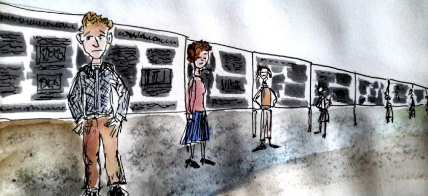
You are waiting and waiting and people are rushing by. Nobody asks anything. Maybe some colleagues join you for a moment, out of solidarity. But they are not the audience you try to reach.
The poster session is often not very exciting for visitors neither: there are hundreds of posters, each of them really complex, designed to be carefully studied with full concentration for several minutes.
But this is quite an investment of time and attention – the scarcest resources of a human being. How can visitors quickly decide which poster is worth their time? At first glance most posters absolutely do not inspire any questions.
Can we learn from psychological research ?

Last year Mike Morisson, a Ph.D. candidate in organizational psychology at Michigan State University published a tutorial video on youtube which went viral. Morisson proposed with #betterposters a radical new design, based on studies in cognitive psychology and usability research.
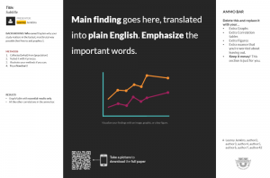
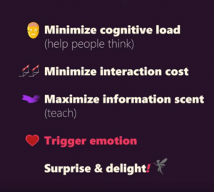
His model for a better poster looks very simple: In giant letters, a statement or conclusion based on your studies is given. Ideally in plain language in order to minimize the cognitive load.

This is because even scientists are humans. The working memory, which processes new information, is a real bottleneck: It can process only 5 to 9 new informations – and some of these slots are already occupied by thinking about the recent talk or the next coffee break. So make it easy to grasp the essential message of your study. This might require some hard thinking from your part!
Capturing the key message at a glance
Make sure that your key message can be read from afar, so that a visitor strolling by could decide within seconds whether to come over and talk to you. On the left side of the statement, Morrison recommends a “silent column” with a short introduction into the research and context information, offering something to read for the visitor. And on the right side, the “ammunition column”, you could host additional information, tables, graphs, which will help to explain the research in more detail.
An Example from HZB-Research
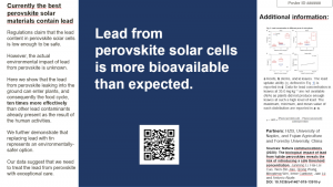
 An example (quickly done) related to HZB research: “Lead in perovskite solar cells is more bioavailable than expected.” This shows not only the relevance of the research done, but triggers certainly a lot of questions – which are the fuel for scientific curiosity and advance. The side bars refer to the study design and results. The QR code refers to the full paper.
A poster is NOT a paper
Mike Morrison’s approach is quite radical, but as far as I see, it is quite consense to get rid of long text, since no one will read it anyway and to simplify graphs. Neuroscientist Bahador Bahrami (LMU Munich), who proposes a more traditional design for posters, advises to restrict text to a minimum and focus on one key message. “First, a poster is NOT a paper. A poster is a visual presentation of the most important and interesting features of your work”, he writes in his blog post and adds: “Subtleties of paper writing are not for posters. In a paper you may say “Many studies have considered A to be B”. On your poster you should say A is B.”
Summary: better Posters look easy – but are not
 The good news: you can do a #betterposter without being a designer. You do not have to invest time to do fancy graphics, if this is not part of your skills anyway. You can use a very simple design and still get your message through. It just needs a bit of boldness to present such a non traditional poster in a session full of posters which are – in fact – rather condensed papers.
It looks easy and it is easy to make – but it requires some thourough reflections non the less: You have to think very hard on your key message and why your research matters. Which is a good thing to do anyway.
I would love to discuss. Maybe your experience in poster sessions is completely different. Please write a comment or contact me directly.
Sources:
Plain Language Is for Everyone, Even Experts
Limited capacity of working memory
What is cognitive load and why should we minimize it?
Blogpost on academic posters by neuroscientist Bahador Bahrami
